|

|
The ABC Types collection embraces all the aspects of today’s modern typographic needs from classical styles to grunge and is the creation of Tony Mayers, a British type designer. Most popular design is Generation Gothic.
|
 |
ACME:
See Also: Interview | Downloadable PDF |
|
Deconstructed fonts, Anti-abbreviation fonts, fonts which don't manifest as letter forms, fonts based on the shape of steam irons and carplates - just a few of the varied delights on offer from ACME FONTS. Founded in 1999 by Christian Küsters, ACME FONTS represent various designers all of whom believe that type, as a medium, can be pushed beyond its accepted boundaries. Popular Acme fonts include Carplates, Diwa and Generation.

Still one of the key players in the industry, Adobe continues to release important, influential and beautifully crafted type families in OpenType CFF format, often crammed with an impressive features list. Acclaimed recent releases include Garamond Premier Pro, Bickham Script Pro, Brioso Pro and Warnock Pro.
Alan Meeks is an ex Studio Manager and Senior Type Designer at Letraset in the UK. The Alan Meeks Type Collection includes the popular Astoria font family and his take on Trajan, Colosseum. Other high quality families include Fairway, Chalfont, Copacabana, Vatican and Brigade.
|
 |
Alias:
See Also: Interview | Downloadable PDF |
|
Alias was formed in 1996 to design and market the typefaces created by Gareth Hague and David James who had collaborated on sleeves for the likes of Soul II Soul, Neneh Cherry and System 7. Alias features radical typefaces with a strong design element that makes them suitable as both headline and text faces. Gareth Hague describes their origin as "Combining traditional drawing values with the computer's mastery of geometric form."
Alias has produced logotype and typeface design for clients including Ghost, Monsoon and Sunday Times Magazine. Graphic design includes arts-related projects and book design for clients including Phaidon, Jake and Dinos Chapman, Tate Modern, and Birkenstock.
|
 |
Archive Type:
See Also: Downloadable PDF |
|
Archive Type specializes in old typefaces found in old prints, books and samples. The fonts, with the imperfections from years of good service all perfectly preserved, bring a 19th century typography to the digital age.
James Marsh is the man behind ArtyType, a designer, painter, illustrator and former Studio Manager at Decca Records with decades of experience but who has only recently added type design to his arsenal of creative talents. Launching with 3 innovative and eye-catching display faces: Marsh Scroll, Nutcase and Tulip.
|
 |
The Ascender Corporation: |
|
The Ascender Corporation has been authorised to produce and distribute the core Microsoft fonts such as Verdana, Tahoma and Trebuchet. Fontworks are now able to offer these faces to our customers.
Microsoft's fonts are highly regarded for their on-screen quality and extensive character sets. Microsoft selected Ascender because of their years of font development and licensing expertise, and their ability to maintain the integrity of Microsoft's type designs and font software quality. Now for the first time these fonts are being made available. Ascender has also made many of these fonts available in the PostScript format for the first time. These fonts will also be appealing to IT managers who want to standardize on certain fonts for their enterprise in all font formats.
|
 |
Barnbrook Fonts (formerly known as Virus):
See Also: Interview | Downloadable PDF |
|
In between collaborations with Tony Kaye and Damien Hurst, Jonathan Barnbrook has produced an extraordinary range of typefaces. Elegant and beautifully presented, his font collection brings many of these unusual, sometimes disturbing, typefaces together through a vehicle that challenges politically as well as from a design perspective.
|
 |
Berthold: Berthold BQ
See Also: Downloadable PDFs | Display Case |
|
Ever since Hermann Berthold founded the company in 1858, the Berthold name has been synonymous with the highest standards of typeface design. Within every Berthold typeface, each character is crafted with the utmost attention to detail in order to achieve typographic and aesthetic harmony. Famous faces such as Akzidenz Grotesk, Formata and Imago are now available in OpenType Pro+ format including Cyrillic, CE and Greek layouts.
|
 |
Bitstream:
See Also: CD Libraries |
|
Most people associate the name Bitstream with affordability, especially since their Type Odyssey 2 library retails for less than £1,000, but the involvement of such type luminaries as Matthew Carter is always an assurance of quality. Less well known is Bitstream's involvement in developing the Prima font for Netscape and the Tiresias font for the Royal Institute for the Blind.
Best of British! A diverse range of display, text and script fonts from the Pat & Paul Hickson stable, a husband and wife type team with a wealth of experience in the industry.
 
Chank Diesel began making fonts in 1992 when he worked as creative director of the alternative music magazine Cake. One of the pioneering font retailers on the web, Chank is perhaps best known as a designer of fun, cartoonish display faces, however the extensive new Adrianna suite of text fonts complete with Cyrillic support shows he's no one trick pony. The first font he created, Mister Frisky, remains his most popular. Other best sellers include Brubecks Cube and the 'Go Font Yourself' (GFY) handwriting font collection. Grab the exclusive Adrianna BigSmalls free font now!

China Type was established in 1986 to produce Chinese fonts for the Monotype Lasercomp laser imagesetter targeted to the publishing industry.
|
 |
Darren Scott Typographics:
See Also: Downloadable PDF | Movie |
|
Darren Scott graduated from Salford University in Manchester with a Design Practice Degree in 96. Formerly the Senior Designer and Typographic Consultant at McCann-Erickson Manchester, Darren now runs his own consultancy, Truth Design. Designing fonts was something he developed as a student. He was asked to develop a typeface for FUSE 15 [Cities] in 95 which led to Berlin[er] his first digital font. His love affair with visible language has developed from there.
|
 |
Device:
See Also: Downloadable PDFs | Display Case |
|
Device is the font foundry from internationally respected type designer, graphic designer and illustrator Rian Hughes. His broad and distinctive work has featured strongly in such diverse campaigns as Swatch, Virgin Atlantic, MTV, BBC, and DC Comics. Now over ten years old Device is consistently releasing new families and reviving old faces. Rian contributes to numerous international exhibitions, lectures widely both in the UK and abroad, as well as collecting awards for his work. The most prolific man in the type business, Rian produced the wonderful "Ten Year Itch" retrospective reference book in 2005 and shows no signs of slowing down!
See Also: Display Case
DSType was founded in late 1994 by Dino dos Santos who has since designed typefaces for several corporations, magazines and cultural projects. Dos Santos has created some notable typefaces like Andrade, winner of the Creative Review Type Design Award for the Best Revival / Extension Family in 2005 and Ventura, awarded the Certificate of Excellence in Type Design by the Type Directors Club of New York in 2008. Other notable releases include contemporary sans Priva Pro which includes Greek and Cyrillic glyphs and the versatile Leitura Type System. DSType's new premium type series has been launched with the professional Glosa and Prelo families. The glorious Estilo Pro, a major upgrade to DSType's popular Estilo family, appeared in the summer of 2010.

DTP Types have been involved with digital typography for over 17 years, developing high quality font software and font related systems. All fonts are available in cross-platform OpenType (OTF) format and include Western, CE, Baltic and Turkish layouts. In addition, the Pro fonts (Delargo, Newhouse, Garamond 96, Pen Tip) are equipped with Cyrillic and Greek layouts plus a host of additional OpenType features, Small Caps, Old Style Figures, stylistic alternates and schoolbook glyphs.

Since 1987, Dynacomware has been the leading font developer and vendor of Chinese fonts, Japanese fonts and Korean fonts for the Asian market and has been providing the likes of Microsoft and Apple with Chinese system fonts for their Chinese operating systems since the mid 1990's. DynaComware have a vast library of over 500 high quality Traditional Chinese fonts, Simplified Chinese fonts, Japanese fonts and Korean fonts.
The DynaComware library contains the following popular CJK font families: DF Hei Traditional Chinese, DF Li Hei Traditional Chinese, DFP Hei Simplified Chinese, DFP Song Simplified Chinese, DF Gothic P Japanese, DF Gothic Japanese, DFHS Gothic Japanese, DFHS Mincho Japanese, DFK Gothic Korean and DFK Mincho Korean.
|
|
Emigre, Inc. is a digital type foundry, publisher and distributor of graphic design related software and printed materials based in Northern California. Founded in 1984, coinciding with the birth of the Macintosh, Emigre was one of the first independent type foundries to establish itself centered on personal computer technology. Emigre holds exclusive license to over 300 original typeface designs created by a roster of contemporary designers. Emigre's full line of typefaces, ornaments and illustrations is available in OpenType, Type 1 PostScript and TrueType for both the Macintosh and PC.
Emigre is also the publisher of the critically acclaimed design journal Emigre magazine which was published between 1984 and 2005.
 |
exljbris foundry:
|
|
Jos Buivenga can be passionate about a lot of things. He loves to paint, listen to music, brew an almost perfect espresso… but nothing challenges and rewards him more than designing type. If ever he was stranded on a desert island he would still draw alphabets in the sand, even if there was no one else to see them.
He is the founder of exljbris, the one-man Dutch font foundry through which he releases and offers his typefaces. For 15 years, his online friends and fans could follow the development of his typefaces and download the results at no cost. In 2008, while still working as an art director at an advertising agency, he released his first commercial typeface Museo with several weights offered for free. That strategy paid off and Museo became a huge bestseller. Partly thanks to that success he now calls himself a full time type designer. Recent projects include a custom version of Museo & Museo Sans for Dell and the Questa project, a collaboration with the well-known type designer Martin Majoor.
FaceType is a small Austrian foundry based in Vienna, founded in 2008. Notable fonts include the elegant Ivory family and the quirky Strangelove, their homage to Stanley Kubrick's cold war masterpiece Dr Strangelove.
|
 |
Fathom: |
|
Fathom: PlayStation, Manga and motor racing. Just some of the healthy interests behind this debut collection by Anthony Roberts, a former director of Manchester design agency, Fathom. And the purpose? An attempt to discover where letterforms lose the will to live.
Font Bureau was founded in 1989 by noted publications designer and consultant Roger Black and type designer David Berlow to serve the emerging needs of microcomputer-based magazine and newspaper publishers seeking unique typographic identities.
The New York Times, Newsweek and Smart were among the first clients to commission type designs. Over the last few years, Font Bureau has designed over 1,000 fonts for over 300 publications, most of them becoming part of Font Bureau’s burgeoning Retail Library. It has steadily grown into one of the finest and most varied collections around, featuring the likes of Interstate, Stainless, Agenda, Amplitude, Miller, Griffith Gothic, Benton Sans and Bureau Grotesque, now vastly expanded and known simply as Bureau Grot.
The Third Edition of Font Bureau’s Specimen Book is available here.
|
 |
Fountain: |
|
Fountain is the name of a new, young and apparently quite friendly independent foundry - from Sweden! Amongst their newest releases are NUEPHORIC designed by Lee Basford & James Glover from Fluid, DANG designed by Jay David & the futuristic ROBOTRON designed by Dirk Uhlenbrock from Eyesaw.

GarageFonts was established in 1993, primarily as a vehicle to distribute some of the first typeface designs created for Raygun magazine. What started as a small library of trend setting designs has now grown to a varied collection of original, accessible text and display typefaces including the ever popular Freight font series.
|
 |
G-Type:
See Also: G-Type Display Case
|
|
After a few years of designing corporate fonts and lettering, G-Type founder Nick Cooke released his first collection of typefaces in 1999, including the families Houschka and Nubian, and the single fonts Geetype and Gizmo. He has designed fonts which are in use by leading companies and publications including Laura Ashley, Hardy Amies, MacUser magazine, Sainsbury's Magazine, The Mail On Sunday and The Scottish Football Association. Chevin, a rounded sans face named after a hill near Nick's home in West Yorkshire, is highly prominent as Royal Mail's Corporate Font. Nick's first OpenType release is a wonderful pen script called Olicana Rough which is stuffed full of alternates and features including multiple ligatures and swash variants; Olicana Smooth and Olicana Fine are also now available.
Feb 2008 saw the release of Houschka Rounded, a six weight OpenType companion to the original Houschka sans face. Nick finally issued the revamped and much improved Houschka Pro in December 2008. Chevin Std and Chevin Pro are the latest families to receive a massive OpenType facelift.
|
 |
HamburgerFonts: |
|
HamburgerFonts is a small type foundry producing original and contemporary fonts. The foundry name is a reference to an anglicised version of the word 'Hamburgefons', popularised by type specimen books in the 1970's, and used as a string of characters to determine the look and feel of a desired font. HamburgerFonts is run by UK-based typographer and graphic designer Stuart Brown who has been designing digital typefaces and letterforms since the late nineties.

HVD Fonts is based in Berlin, founded by Hannes von Döhren in 2002. After completing his studies (graphic design) in 2005 von Döhren, who also has fonts in the Linotype, ITC & T26 collections, worked in an advertising agency in Hamburg. Since 2007 he has been working as a freelance graphic and type designer in Berlin. A truly diverse range of quality OpenType fonts ranging from the round and friendly Brevia sans family to the graffiti masterclass that is The Subway Types.
|
 |
Heinemann:
|
|
The Heinemann fonts were initially developed by the in-house design team at Heinemann educational publishing out of the necessity to find the perfect font for use in early primary reading books and literacy products.
Basic Heinemann is defined by longer ascenders and descenders which help children to distinguish between letters; rounded edges on all letterforms help focus the reader on the individual letter shape; and modified characters (eg. a, g,) ensure instant recognition of letterforms. Heinemann Special offers further modified characters and kerning pairs ideal for dyslexic or special needs use (eg a, d, b).
The Heinemann fonts were developed in partnership with children, literacy advisors, teachers of special needs/dyslexia and primary school teachers, and are now released in response to hundreds of requests from publishers, designers and teachers to purchase them. They have been trialled in schools and learning institutions over an 8 year period, and are a favourite for use in both print and electronic product. The modern, clean aesthetic of the fonts ensures that their use can span beyond educational application. Heinemann and Heinemann Special are available in OpenType format in three weights roman, bold and black + italic of each.
|
 |
Identikal:
See Also: Downloadable PDF (1) | PDF (2) | Display Case |
|
We are delighted to promote the creative outpourings of Nick and Adam Hayes, 2 identical twins currently ripping it up in New York. Innovative faces such as 'Sharp', 'Phat', 'Rayzor', 'Seize' and 'Kneeon', inspired by the club and underground dance music scene, set new standards in contemporary type design. 2008 sees the boys celebrating their 10th anniversary in design.

A new foundry from london-based typographer/designer Duncan Rogers. Duncan’s a sucker for type who probably spends far too much of his time experimenting with display fonts where the individual characters must not only look good as a stand-alone image but also work inside a body of text. First offering Worm Punch is a good example. Image Daddy: it’s gotta be different, it’s gotta be pretty, and you’ve gotta be able to read it!

Insigne Design was originally founded in 2004 as DooleyType, after its owner Jeremy Dooley. In 2005, Jeremy graduated with a master's degree in graphic design from Savannah College of Art and Design and founded Insigne in the same year. Since then, Insigne has released a wide variety of quality typefaces, including sans serifs, scripts, serifs and experimental forms. Insigne prides itself on its unique and diverse typeface library and affordable fonts.
A world traveller, Jeremy grew up in Europe and the Middle East and has travelled extensively to many countries, gaining inspiration along the way.
International Typeface Corporation (ITC) was established more than 35 years ago to design and market typefaces to creative professionals. Designs vary from classic to contemporary, including newer additions such as OpenType® Pro versions of the ITC Goudy Sans® and ITC Officina™ families.
The ITC Library, OpenType Edition offers more than 1650 type styles in over 1300 files including 100 new releases and over 650 styles not found in any other collection. Prominent designs include the widely-used ITC Franklin Gothic®, ITC Stone®, ITC Officina® and ITC Conduit® families. ITC Resavska™, ITC Tactile™ and ITC Stone® Humanist highlight a batch of stunning new releases.
|

|
Isaco Type:
|
|
Isaco Type is a Brazilian digital foundry who specializes in the creation of highly graphic, advanced technology fonts. Through constant development and carefully observing the great classics of type design, Isaco Type strives to produce contemporary, balanced typeface concepts that take full advantage of OpenType architecture.
Currently there are two typeface ranges. The beautifully crafted, calligraphic Mayence contains 430 ligatures (in the Premium version) to create a naturally flowing elegance that is complimented by an impressive range of borders and ornaments, and Monarcha is a serif family in a baroque style with delicious fluidity and texture that includes many typographical features and stylistic options, there is also language support for CE, Baltic and Turkish languages.
|
|

|
Latinotype:
|
| Latinotype is a new digital type foundry established in the year 2007 in the city of Concepción, Chile. Their goal is to design new typefaces remixing diverse influences related to their South American identity (most often known as “latino”) with high quality products for the contemporary design industry. |
|

|
Linotype GmbH:
See Also: Linotype CD Collections | Display Case |
| For more than 100 years, Linotype fonts have been gracing all forms of printed and electronic material around the world. It is a rich heritage which boasts many classic designs and industry staple fonts - Frutiger™, Univers™, Helvetica™ et al and many pi & symbols sets. The Linotype name has become a standard which represents original design, manufacturing excellence, integrity, faultless reproduction and the highest quality. |
|
 |
LucasFonts: |
|
"Luc(as) de Groot, born in the Netherlands in 1963, studied type design and typography at the Royal Academy of Fine Arts in The Hague under Gerrit Noordzij. He then spent four years with the Dutch design group BRS Premsela, working mainly on corporate identities. A period of freelancing and teaching at the Art Academy in Den Bosch followed before Luc(as) moved to Berlin in 1993 to work with MetaDesign for four years. In 1997 he founded FontFabrik in Berlin. Devoted to type day and night, Luc(as) admits to occasionally finding time to sleep between work, writing and drawing. The fonts in the LucasFonts collection, an eclectic mix of serif, sans-serif and display, offer perfect solutions for typographic branding in graphic design, advertising and publishing. Celebrated font releases include TheSans, Corpid, Sun and TazIII, an extensive family containing 5 hairline weights!
|
 |
LUST: |
|
"LUST is the missing piece of the puzzle. The one, small piece you need to either finish the puzzle - or throw it away altogether. That is the moment we wish to capture in our work..." Jerone Bardense & Thomas Castro of this very idiosyncratic Dutch design outfit have also produced a unique collection of fonts. As they explain: "For us, the process is our end product and not the search for any so-called ultimate image. Because in the end it is not the image that endures, but the IDEA."
The Mecanorma Collection represents one of the finest font libraries of display typefaces around, combining real arts and crafts into the tools of today. The typefaces are licensed from Trip Productions who is the legal successor to the French type foundry.

The history surrounding the Monotype foundry dates back to the Lanston Monotype Machine Company, which pioneered mechanical typesetting in the 1880s. From typefaces such as the Times New Roman® family designed originally for The Times newspaper of London in the 1930s, to the latest releases such as Felbridge, Neo Sans and Soho, Monotype fonts have helped to create various recognizable brands.

Mark Simonson is an American graphic designer and illustrator who specializes in lettering, typography and comtemporary font design. Mark has been developing typefaces since the late 70s and his first commercial releases were Felt Tip Roman, Kandal and Proxima Sans.
Mark opened the Mark Simonson Studio foundry in 2000 and began releasing a number of new designs – Blakely, Felt Tip Senior, Refrigerator and Coquette. These were followed by Sharktooth and Mostra. In 2003, Mark added new fonts to the Blakely, Refrigerator, Sharktooth and Felt Tip Roman families and produced a number of new font ranges: Changeling, Goldenbook, Felt Tip Woman and Metallophile Sp 8.
In 2005 Mark completely reworked Proxima Sans to create the stunning Proxima Nova super family of 42 fonts which is available as a complete collection for just £399. Proxima Nova bridges the gap between Futura and Akzidenz Grotesk and is an original sans that combines geometric clarity with humanistic readability.
Ogentroost is the typographic arm of Diederik Corvers' Klaar Ontwerpen Design Consultancy based in the Netherlands. Klaar can be translated as clear, open, clean, transparent and pure, all bywords for Corvers' brand of (typo)graphic communication which employs minimal means for maximum effect. A focus on quality, not quantity.
Ogentroost's first OpenType release was inspired by a visit to the Scandinavian land of forests and lakes. The Suomi type family, says Corvers, "is like bent wooden furniture, which they happen to have a lot of. The squared-off round shape captures the paradox I found in Finland, severe around the edges, but relaxed at heart".
|
 |
P22: |
|
P22 type foundry creates computer typefaces inspired by Art, History, and sometimes Science. P22 is renowned for its work with museums and foundations to ensure the development of accurate historical typefaces that are fully relevant for today's computer user. In addition to its in-house font design, P22 now licenses several new type designs from around the world. Each font set is packaged with background information on its source and inspiration.

Parachute is a multi award winning Greek foundry based in Athens with a growing reputation for creating professional, feature rich multi-lingual OpenType Pro fonts in a truly diverse range of styles. Equally adept at making fresh corporate fonts or versatile display types, all Parachute releases offer a Pan European language solution which includes CE, Greek and Cyrillic. Notable typefaces include the PF Centro series (Sans, Serif & Slab), a comprehensive DIN range and the quite wonderful PF Champion Script Pro, the world's most powerful and complete script face with over 4,000 glyphs in its locker.

Positype is Neil Summerour, a type designer, lettering artist, calligrapher and designer based in Georgia, USA with one foot in Takamatsu, Japan. After graduating from The University of Georgia Lamar Dodd School of Art with a BFA in Graphic Design, he soon found himself opening his own studio to deal with the flow of freelance work. This evolved into a 10-year dance in the design, web and advertising world allowing him to work with clients large and small—each time producing and developing unique creative solutions. His desire to not do the 'same-old, same-old' continues today. During this time, Neil opened his personal type foundry, Positype, in 2000 to feed his ever-growing desire for type design (something of which, oddly, he considered a hobby to keep him busy late at night). He later co-founded TypeTrust (2002) with Silas Dilworth as his addiction to type and lettering grew. All the while, Neil has continued his commitment to education and fostering young talent as an adjunct art professor at The University of Georgia in graphic design and teaching graphic design at the Governor’s School for the Arts. His work spans across media types and centers on problem solving and communicating graphically (with an obvious emphasis on type and lettering)—and it’s this balance of educator, designer, and entrepreneur that allows him to bring a unique and practical insight to solving a client’s communication needs, regardless of the medium.
As a typeface designer, he has published over 60 typeface families (that’s over 500 fonts) and produced numerous custom typefaces for clients worldwide. You cannot watch TV, go online, or shop in your local grocery store without possibly seeing one of his fonts being used.
He has won the Type Directors Club Certificate of Excellence in Type Design in 2010 and 2011 for Fugu and Nori, respectively.
Prime Graphics is definitely a collection of fun, original, and innovative type designs. Choose from over 100 fonts.
profonts is a digital type company based in Hamburg, Germany, under the direction of Peter Rosenfeld and Dr. Jürgen Willrodt. profonts' mission is to release a beautiful series of script and display designs from the past, all in OpenType format and incorporating the necessary features and ligatures that make scripts come to life.
|
 |
Red Rooster Collection:
|
|
Red Rooster was formed by Steve Jackaman, a prominent and experienced type marketer of long-standing.
As well as many exciting releases, the Red Rooster collection presents a number of revivals of important faces from the pre-digital era, many of which have achieved legendary status. As with all Red Rooster fonts they are superbly crafted to produce elegant and effective results every time. Steve Jackaman's astute acquisition of Les Usherwood's Typsettra collection, and the preparation he put into its digital release, is a particular highlight of this library. Usherwood's Goudy 38 family (formerly known as Goudy Gimbel after the New York apartment store) is one of several exclusives. Others include his Stanhope family, and Shinn by Nick Shinn.
|
 |
Nick Shinn | ShinnType:
See Also: Downloadable PDF | Display Case |
|
All these typefaces are innovative designs by Nick Shinn. The idea behind this collection was to produce a series of entirely new and original designs that harness certain attributes of more traditional typefaces, but without merely copying or reviving them. In other words a set of instant classics.
Nick Shinn was born in London in 1952 and moved to Toronto in 1977, where he spent the Eighties as art director of an advertising agency. Since 1991 he has divided his time between publication and typeface design.
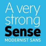
Famed for his newspaper types, Nick's latest release is the eye-catching Sense & Sensibility super family comprising 2 contrasting typefaces, 8 weights and 32 fonts.

Robbie Smith is a graduate of Reigate School of Art & Design and went on to work in Richard Kindersley’s letter carving studio in London. Now a freelance type designer in London trading under the moniker of ‘Smith Hands’, Robbie is focusing on incorporating the pattern and drive of calligraphy into modern styles of lettering that will fit beautifully into the modern corporate world. His first release is Hoplight, a hybrid modern serif overflowing with character and personality. Second release, English Engravers Roman, is a refined masterpiece.
Tomi Haaparanta started designing type in 1990 and has fonts featured in the Linotype, Monotype, ITC, & T-26 collections. In 2004 he decided to go it alone and Suomi Type Foundry (STF) was born, a platform for his wonderfully diverse and versatile fonts. STF text faces are affordable and have an extensive range of weights, scripts such as Suomi Script are invariably friendly and brimming with ligatures.
|
|
T.26 Digital Type Foundry was established by Carlos Segura in 1994 to promote the development, promotion, and distribution of independent type design. T26 is a major force in shaping contemporary design and typography, representing an ever-growing library of over 3000 fonts by a corral of over 200 independent designers from around the globe. With award winning promotional designs by its parent company Segura-Inc., T.26 has maintained its relevance with a dedication to the broader integration of typography with graphic design, fine art, and popular visual culture.

TeGeType is the design studio of Thierry Gouttenègre, a Belgian type designer based in France. After being typedirector for Alfac-Decadry in Belgium, Thierry moved to the South of France (lucky him!) and started his own Design Studio in the mid 90s. In 2007 he set up his TeGeType foundry. He specializes in type design for specific applications, such as signage, engraving and 3D and has worked with Aldo Novarese and Ladislas Mandel amongst others. Notable typefaces designs include Cinio (used in signage applications in several French cities) and Vizille a Fournier text family made for the Musée de la Revolution Française in Vizille.

Tour De Force is a Serbian type foundry founded in 2009 by Dusan and Slobodan Jelesijevic, a highly skilled partnership creating type with a Balkan twist. Belco is an eye-catching sans and slab serif mixed family ideal for text and headlines. Other notable faces include the legibly handwritten Qiltray Condensed, Shuma and Rough The Type.

Alex Kaczun, type designer and founder of Type Innovations, has over two decades of experience in typography & graphic design, much of it spent at Linotype. Alex currently works as a freelance consultant, allowing him to pursue his passion for type design and developing new and innovative fonts. Biggest seller is the extensive Contax Pro family, a "Univers for the 21st Century".

Typefolio Digital Foundry:
Typefolio is a independent Brazilian typefoundry, established by the designer Marconi Lima. Its foundation was motivated by the desire of offering to the international market typographical projects that prioritizes the quality in technique, functionality and aesthetics.

Fantastically diverse collection of type from Nagoya, Japan resident Ray Larabie. Starting out in 1996 Ray produced over 300 freeware fonts for his Larabiefonts vehicle before setting up Typodermic in 2001 to market his burgeoning retail collection. Larabie can turn his hand to almost any type style; experimental and commercial, cutting edge headline fonts, handwriting and graffiti, contemporary text faces, you name it and it's included in this fabulous range at incredibly affordable prices.
|
 |
Ündt TypeFaeces: |
|
Welcome to Ündt TypeFaeces. The foundry features the dark, humorous and sometimes difficult type designs by Marcus Leis Allion. This award-winning designer studied graphic design at Nene College, Northampton (1990-92) before embarking on his freelance career. He enjoys working for a number of clients - including his current employment with Jonathan Barnbrook (Inoui id, roppongi hills) and is art director for Loca Records (locarecords.com). Ündt has produced custom type for a variety of companies, including MTV, Nickelodeon and TWB.

URW++ boasts a hugely diverse collection of text and display fonts suitable for every purpose. Look out for the hugely popular Corporate ASE series by Kurt Weidemann and the impressive selection of language fonts on offer covering CE, Greek, Turkish, Cyrillic etc. Other notable families include URW Antiqua and the massive Nimbus Sans range.
The letters listed after the font names indicate the following:
(T) Text, (D) Display, (L) Laserwriter (former core fonts), (P) Poster, (M) Monospaced, (E) Extremely wide or tight.
|
 |
Wiescher Design:
See Also: Display Case | Downloadable PDF |
| Self confessed "maniac type designer" Gert Wiescher writes crime thrillers and books about food, teaches design theory, travels extensively but mostly crafts wonderful typefaces, in particular decorative scripts, freeflowing cursives and attention grabbing display types. Gert studied at the "Hochschule der Künste" in Berlin. After spells in Paris, Barcelona & S. Africa he is settled in Munich. |
|
 |
|


 | Guest |  |
 |
0 items |
 |
View |
 |
| Total |
 |
$ 0.00 |
 |  |
| |
|
| 
Receive regular e-news bulletins packed with new releases and special offers!
|
|
|
Key benefits:
- shop without c/card
- monthly invoice
- purchase history
- backup resource
- premium content
|
|
| |
|  |
|  |
| |
|
| |
|
|


