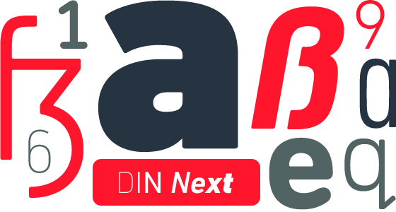
The world famous DIN typeface has been remastered by Linotype to form the new DIN Next Pro font collection, a series of 25 professional OpenType fonts which have been added to Linotype's esteemed Platinum Type Series.
The entire collection of 25 DIN Next Pro fonts can be bought and downloaded instantly by clicking the 'order now' button above. If you'd like to view, test and buy DIN Next single fonts or smaller family volumes please click here.

DIN Next™ is a typeface family inspired by the classic industrial German engineering designs, DIN 1451 Engschrift and DIN 1451 Mittelschrift. Linotype has been supplying its customers with the two DIN 1451 fonts since 1980. Recently, they have become more popular than ever, with designers regularly asking for additional weights. Linotype’s Type Director, Akira Kobayashi, supervised the creation of the new typeface family based on these classic designs.
The project began by analysing and revising the two originals, DIN 1451 Engschrift and DIN 1451 Mittelschrift – whose names mean “condensed” and “regular.” Akira Kobayashi noticed that certain letters were inconsistent: they took one form in DIN 1451 Mittelschrift, and another in DIN 1451 Engschrift. These inconsistencies have been reconciled for the new DIN Next family of seven weights (Light to Black).
Many additional features were added into the typeface during the design process. Each font includes small caps and oldstyle figures. There are also a number of alternates:
1. The uppercase C and G have two forms: one with flat stroke endings, and another with diagonal endings.
2. The uppercase I may be used with or without serifs.
3. The lowercase a has an alternate form that is single-storey, like Futura.
4. The lowercase q has an alternate form where the descender includes an upstroke at its end.
5. The ß has an alternate form that is more like the combination of a long-s and a long-z. This historic letterform is found on the streets signs of West Berlin.
6. The 1 has an alternate form with base serifs.
7. The 6 and 9 have alternate, rounded forms.
8. The 0 has a slashed-zero alternate form.
9. The 7 and the capital Z have alternate versions, with horizontal strokes through their diagonals. This sort of thing is common in German handwriting.
Each of the seven weights of DIN Next ship in three varieties: Regular, Italic, and Condensed.

The typeface family also includes a set of four “rounded”fonts (DIN Next Rounded), to bring the total number of fonts in the family to 25. DIN Next is part of Linotype’s Platinum Collection.

Background
The abbreviation “DIN” stands for “Deutsches Institut für Normung e.V.,” which is the German Institute for Industrial Standardization. In 1936 the German Standard Committee settled upon DIN 1451 as the standard font for the areas of technology, traffic, administration and business. The design was to be used on German street signs and house numbers. The committee wanted a sans serif, thinking it would be more legible, straightforward, and easy to reproduce. They did not intend for the design to be used for advertisements and other artistically oriented purposes.
Since the original DIN 1451 Engschrift and Mittelschrift were developed by engineers, their letters were carefully planned. This is quite unconventional when you study how most typefaces came to life. Each letter was drawn out, almost the way in which an architect makes blueprints for a house. The idea was to ensure that all letters could be easily reproduced at different sizes by machines.
Stencil sets of the DIN 1451 letters were also made, and may still be found on the desks of architects, designers, and engineers all over Germany. In order to write official lettering on plans, the drafter would use these stencil sheets in combination with rapidograph pens. Sometimes, this could get very messy. But most German engineers tend toward the neat and tidy side.
Since DIN 1451 quickly began to cover all of the German signs for town names and traffic directions, it became familiar enough to make its way onto the palettes of graphic designers and advertising art directors as well. The digital version of DIN 1451 would go on to be adopted and used by designers in other countries as well, solidifying its worldwide design reputation.
The adaptation
There are many subtle differences in DIN Next’s letters when compared with the DIN 1451 original. These were added by Kobayashi to make the new family even more versatile in 21st-century media. For instance, although DIN 1451’s corners are all pointed angles, DIN Next has rounded them all slightly. Even this softening is a nod to part of DIN 1451’s past, however. Many of the signs that use DIN 1451 are cut with routers, which cannot make perfect corners; their rounded heads cut rounded corners best.
Here is where DIN Next Rounded again becomes interesting. Its letters go “back to their roots,” or back to the routers that would so often cut them. Routers make rounded letters best, and DIN Next Rounded brings that tradition to your digital desktop.
Conclusion
Linotype’s DIN 1451 Engschrift and Mittelschrift are certified by the German DIN Institute for use on official signage projects. These remain the official German fonts for this sort of work. DIN Next is a completely new design. DIN Next has been tailored especially for graphic designers, but its industrial heritage makes it surprisingly functional in just about any application.
Purchase Options for DIN Next Pro Platinum font family collection from Linotype:
|

