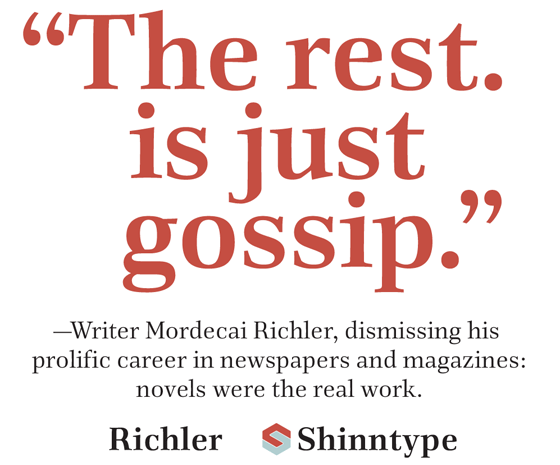
RICHLER is an original type, full of personality in its drawing yet smooth in the composite effect. It is an open, evenly spaced book face designed for both immersive reading and headlines. Display settings are animated by fine details informed by the seminal influence of the broad-nibbed pen on the Antiqua (old style) genre. Each letter is a study in thematic style, with a subtle, firmly crafted, slightly offbeat quality that mocks both artful pretension and dull conformity.
Richler commemorates the Canadian author Mordecai Richler (1930-2001). Taking its cue from his masterpiece, the ingenious Postmodern tour de force Barney’s Version, the Richler typeface combines traditional quality of execution with present-day structure and functionality.
Richler is available in the four basic styles: Roman, Italic, Bold & Bold Italic as well as a titling cut,
Richler was designed and drawn by Nick Shinn, and published by the Shinn Type Foundry in 2013.
The Richler fonts are OpenType .ttf format, for optimum performance across the board. Prices below are for the basic 5-person desktop licence. Webfonts are available upon request.
The standard (basic) versions have no special designation, while “Pro” indicates features such as small caps and alternate figure styles. These basic fonts have one set of figures — proportional oldstyle — and no OpenType features.
These fonts have the full European Latin script encoding, including Central European, Turkish, Baltic, etc.
Single weights also available:
|

